TB
D
Contact
Open to opportunities
Product Design • Consumer • Mobile App • User Research • Usability Testing
Simplifying group coordination for active moms through research-led design.
Project
Trail Mamas
Role
UX Researcher & Designer
TYpe
Concept App
Deliverable
Mobile Prototype →
Research defined the audience, then shaped the design.
1
2
3
4
5
6
Competitive Analysis
7 apps audited
User Interviews
5 hikers • pivot
Card Sort + Sitemap
IA foundations
Wireframes + Flows
Lo to mid fidelity
Hi-fi prototype
Join • plan • vote
Usability Testing x2
Iterations to final
The Context
Hiking is a popular activity in Colorado, and the Denver metro area especially, for solo adventurers, families, and groups of friends. Planning a group hike is logistically harder than going alone. People are already using a stack of separate apps to plan trips including AllTrails for trail discovery, Google Maps for proximity, and WhatsApp or Messenger to coordinate with friends. Flipping back and forth between three or four apps to get out the door has potential to generate enough friction to make the idea of a hike more work than it's worth.
Trail Mamas is a concept app that consolidates trail discovery, group coordination, and real-time conditions in one place. The audience emerged from user interviews rather than the original brief and, as the name implies, became moms planning hikes with their kids and with other families.
7
Apps reviewed across hiking and group planning
5
Interviews that shifted the audience focus to moms
2
Rounds of usability testing
Research
Competitive Analysis — 7 apps
The competitive analysis looked at how current apps were handling hiking and group planning. Seven apps were reviewed across two categories.
The hiking apps each excelled in a narrow focus. AllTrails in trail discovery. Komoot in route customization. Cairn in safety and live tracking. Strava in fitness tracking.
The group-planning apps handled scheduling and coordination but weren't built around hiking-specific decisions. Doodle for finding meeting times across a group. Meetup for connecting people around shared interests. Calendly for booking within someone's availability.
None of the apps reviewed combined trail discovery, group coordination, and real-time conditions in one place.
User Interviews — 5 hikers · audience pivot
Five people who hike with friends were interviewed to understand their motivations and their planning process. The interviews identified specific pain points around trail selection, current conditions, and coordination across the apps people were already using.
They also pointed to something the project hadn't started with. The moms in the sample described specific logistical and emotional challenges that the other interviewees didn't raise the same way. They talked about coordinating kids' schedules, finding family-appropriate trails, and making space for their own wellness time. Moms became the focused audience from that point forward, and the value proposition narrowed to fit them.
Personas Derived from research
The Coordinating Mom
Primary Persona
Wants time outdoors for wellness and connection. Coordination overhead, including schedules, trail conditions, skill levels, often makes the effort feel not worth it before anyone has left the house.
The Spontaneous Mom
Secondary Persona
Prioritizes recharge time outdoors with her kids. Needs trail conditions and family-appropriate filters fast. Every minute of planning is a minute she doesn't get back.
Research insights
Wellness comes second
Moms described wanting time in nature for their own wellbeing, but the planning often defaulted to their kids' needs and schedules. Their own time outdoors was the part that got pushed.
Conditions are essential
Trail and weather conditions came up in every interview, either as a current planning concern or as a past frustration when information wasn't available. The stakes are higher with kids in the group.
"One time we were planning to go hiking but there was a wildfire in the area that we didn't know about until we left the house."
— Kate, interview participant
Coordination is the work
Aligning schedules, skill levels, and what kids could handle across a group turned a hike into a logistics project. Several interviewees described the planning effort as the deciding factor in whether a hike happened.
A stack of separate apps
Interviewees described using AllTrails for trail discovery, Google Maps for proximity, and WhatsApp or Messenger to coordinate with friends. Information didn't move between the apps, so the planner held it together.
"I use AllTrails to find new trails, Google Maps to find the proximity of said trail to my location, and WhatsApp or Messenger to coordinate with friends."
— Kim, interview participant
Information Architecture
Card Sort — 5 participants
Five participants completed an open card sort on the app's content. Across the participants, overlapping cards grouped into seven categories. Six became the basis for navigation. A seventh, Motivation and Fitness, sat as an outlier. The app was less about fitness tracking than about getting families on trails, so those cards became content patterns inside other features rather than a destination of their own.
How users grouped content
Social Sharing
Photos
Reviews
Suggest hike
Group challenge
Firsthand experience
Ratings
Groups Comms
Voting
RSVP
Group chats
Check-ins
Group messaging
Social media
Availability
Time
Trail details
Difficulty
Trail length
Elevation
Time
Trail descriptions
Loop
Out & back
Kid-friendly
Shade
Filters
Fitness level
Trail Highlights
Mountain views
Waterfalls
Lakes/rivers
Forest
Caves
Wildlife
Educational
Safety + Updates
Weather
Trail conditions
Cell service
Alerts
Road closures
Trail updates
Safety
Tracking
Facilities/Trip Prep
Parking
Restrooms
Visitor center
Maps
Directions
Tips for kids
Checklist
Schedule
Availability
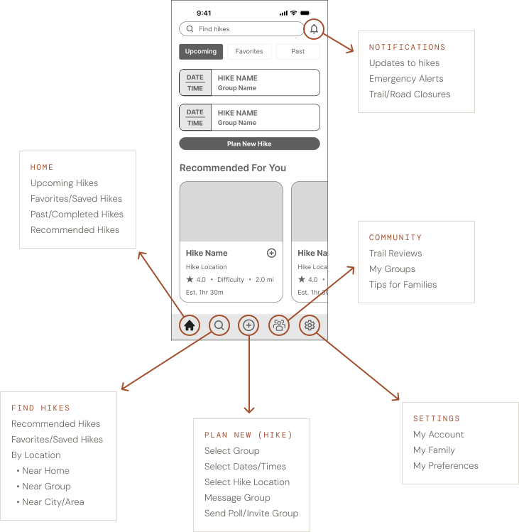
App Navigation Structure
The card sort categories informed the top-level navigation, with additional sections added to handle account-level functions the card sort hadn't covered.
Design Decisions
Early usability testing on a mid-fidelity prototype surfaced several adjustments. A second round of testing on the hi-fi prototype produced more. The decisions below were the architecturally significant ones, not just refinements to wording or filters.
PLANNING FLOW — STACKED DECISIONS TO GUIDED WIZARD
The original planning flow grouped multiple decisions across two screens. Users missed the "add date" and "add location" links that signaled the poll path.
The redesigned flow walked users through discrete steps, asking the poll-or-set-hike question directly. Snack bars confirmed selections and a "Your Plan" tab tracked progress.
Before

After

DATE SELECTION — DROPDOWNS TO CALENDAR
A calendar view replaced the dropdowns.
Setting a single date in the original flow required three sequential dropdown selections. Testing showed users preferred to scan and confirm a date in one interaction.
Before

After

HIKE BROWSING — MAP AND LIST VIEW TOGGLE
The map view showed trails by proximity, which suited browsing to discover trails in an area. The list view showed trails as scannable cards, which suited finding a specific hike quickly. The design included both with a toggle between them.
The map view adapted to context. Inside the planning flow with a group selected, it showed trail pins alongside avatars marking where each group member was coming from, so the group could see a hike's proximity to everyone before picking a trail. Outside the planning flow, the map showed trails relative to a selected location or the user's saved location.
Map View

List View

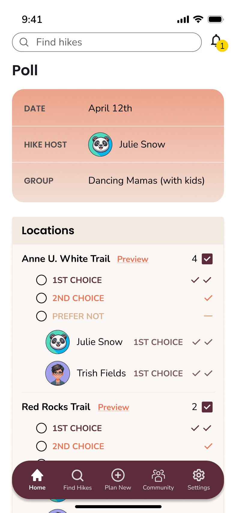
POLL RESULTS — VOTE COUNTS TO AVATARS
Group coordination depends on knowing who wants what, not just how many. The original poll showed vote counts only. Testing in the final round showed users wanted to see who voted for which options.
Before

After
additional Refinements
Final usability testing also surfaced smaller refinements like an 'I'll Choose' poll option, expanded filter categories, and consistent filter availability across screens.
Outcome
Usability testing on the hi-fi prototype was positive. Users responded well to the planning flow, the profile preferences and trail filters, the in-app weather conditions, and the option to download maps for offline use. The standout features across both rounds were the group-poll function and the map view showing hikes near each group member's location.
Seeing hikes near each person's location on the same map! That's the feature that would make me sign up.
— Helen, usability test participant
Key Screens
View Prototype →

Upcoming hikes, open polls, and personalized recommendations on a single dashboard.

The map view populates hikes near each group member's location, so proximity is a shared decision.

The wizard-style planning flow breaks group planning into discrete steps, reducing mental load.

Poll results show who voted for what, making group dynamics visible alongside vote counts.
Future Opportunities
1
Push notifications and contact sharing within groups
2
Start-hike check-ins with emergency contacts or GPS tracking
3
Age-range filters for more refined hiking recommendations
4
Reservation indicators for hikes that require them
5
Carpool coordination
6
Expand social features to connect with area moms
Product Design • Consumer • Mobile App • User Research • Usability Testing
Simplifying group coordination for active moms through research-led design.
Simplifying group coordination for active moms through research-led design.
Research defined the audience, then shaped the design.
1
2
3
4
5
6
Competitive Analysis
7 apps audited
User Interviews
5 hikers • pivot
Card Sort + Sitemap
IA foundations
Wireframes + Flows
Lo to mid fidelity
Hi-fi prototype
Join • plan • vote
Usability Testing x2
Iterations to final
1
2
3
4
5
6
Competitive Analysis
7 apps audited
User Interviews
5 hikers • pivot
Card Sort + Sitemap
IA foundations
Wireframes + Flows
Lo to mid fidelity
Hi-fi prototype
Join • plan • vote
Usability Testing x2
Iterations to final
The Context
Hiking is a popular activity in Colorado, and the Denver metro area especially, for solo adventurers, families, and groups of friends. Planning a group hike is logistically harder than going alone. People are already using a stack of separate apps to plan trips including AllTrails for trail discovery, Google Maps for proximity, and WhatsApp or Messenger to coordinate with friends. Flipping back and forth between three or four apps to get out the door has potential to generate enough friction to make the idea of a hike more work than it's worth.
Trail Mamas is a concept app that consolidates trail discovery, group coordination, and real-time conditions in one place. The audience emerged from user interviews rather than the original brief and, as the name implies, became moms planning hikes with their kids and with other families.
7
Apps reviewed across hiking and group planning
5
Interviews that shifted the audience focus to moms
2
Rounds of usability testing
7
Apps reviewed across hiking and group planning
5
Interviews that shifted the audience focus to moms
2
Rounds of usability testing
Research
Competitive Analysis — 7 apps
The competitive analysis looked at how current apps were handling hiking and group planning. Seven apps were reviewed across two categories.
The hiking apps each excelled in a narrow focus. AllTrails in trail discovery. Komoot in route customization. Cairn in safety and live tracking. Strava in fitness tracking.
The group-planning apps handled scheduling and coordination but weren't built around hiking-specific decisions. Doodle for finding meeting times across a group. Meetup for connecting people around shared interests. Calendly for booking within someone's availability.
None of the apps reviewed combined trail discovery, group coordination, and real-time conditions in one place.
User Interviews — 5 hikers · audience pivot
Five people who hike with friends were interviewed to understand their motivations and their planning process. The interviews identified specific pain points around trail selection, current conditions, and coordination across the apps people were already using.
They also pointed to something the project hadn't started with. The moms in the sample described specific logistical and emotional challenges that the other interviewees didn't raise the same way. They talked about coordinating kids' schedules, finding family-appropriate trails, and making space for their own wellness time. Moms became the focused audience from that point forward, and the value proposition narrowed to fit them.
Personas Derived from research
The Coordinating Mom
Primary Persona
Wants time outdoors for wellness and connection. Coordination overhead, including schedules, trail conditions, skill levels, often makes the effort feel not worth it before anyone has left the house.
The Spontaneous Mom
Secondary Persona
Prioritizes recharge time outdoors with her kids. Needs trail conditions and family-appropriate filters fast. Every minute of planning is a minute she doesn't get back.
Research insights
Wellness comes second
Moms described wanting time in nature for their own wellbeing, but the planning often defaulted to their kids' needs and schedules. Their own time outdoors was the part that got pushed.
Conditions are essential
Trail and weather conditions came up in every interview, either as a current planning concern or as a past frustration when information wasn't available. The stakes are higher with kids in the group.
"One time we were planning to go hiking but there was a wildfire in the area that we didn't know about until we left the house."
— Kate, interview participant
Coordination is the work
Aligning schedules, skill levels, and what kids could handle across a group turned a hike into a logistics project. Several interviewees described the planning effort as the deciding factor in whether a hike happened.
A stack of separate apps
Interviewees described using AllTrails for trail discovery, Google Maps for proximity, and WhatsApp or Messenger to coordinate with friends. Information didn't move between the apps, so the person organizing the trip held it together manually.
"I use AllTrails to find new trails, Google Maps to find the proximity of said trail to my location, and WhatsApp or Messenger to coordinate with friends."
— Kim, interview participant
Information Architecture
Card Sort — 5 participants
Five participants completed an open card sort on the app's content. Across the participants, overlapping cards grouped into seven categories. Six became the basis for navigation. A seventh, Motivation and Fitness, sat as an outlier. The app was less about fitness tracking than about getting families on trails, so those cards became content patterns inside other features rather than a destination of their own.
How users grouped content
Social Sharing
Photos
Reviews
Suggest hike
Group challenge
Firsthand experience
Ratings
Groups Comms
Voting
RSVP
Group chats
Check-ins
Group messaging
Social media
Availability
Time
Trail details
Difficulty
Trail length
Elevation
Time
Trail descriptions
Loop
Out & back
Kid-friendly
Shade
Filters
Fitness level
Trail Highlights
Mountain views
Waterfalls
Lakes/rivers
Forest
Caves
Wildlife
Educational
Safety + Updates
Weather
Trail conditions
Cell service
Alerts
Road closures
Trail updates
Safety
Tracking
Facilities/Trip Prep
Parking
Restrooms
Visitor center
Maps
Directions
Tips for kids
Checklist
Schedule
Availability
App Navigation Structure
The card sort categories informed the top-level navigation, with additional sections added to handle account-level functions the card sort hadn't covered.
Design Decisions
Early usability testing on a mid-fidelity prototype surfaced several adjustments. A second round of testing on the hi-fi prototype produced more. The decisions below were the architecturally significant ones, not just refinements to wording or filters.
DATE SELECTION — DROPDOWNS TO CALENDAR
Before
After

Setting a single date in the original flow required three sequential dropdown selections. Testing showed users preferred to scan and confirm a date in one interaction.
A calendar view replaced the dropdowns.
PLANNING FLOW — STACKED DECISIONS TO GUIDED WIZARD
Before
After
The original planning flow grouped multiple decisions across two screens. Users missed the "add date" and "add location" links that signaled the poll path.
The redesigned flow walked users through discrete steps, asking the poll-or-set-hike question directly. Snack bars confirmed selections and a "Your Plan" tab tracked progress.
HIKE BROWSING — MAP AND LIST VIEW TOGGLE
Map View
List View
The map view showed trails by proximity, which suited browsing to discover trails in an area. The list view showed trails as scannable cards, which suited finding a specific hike quickly. The design included both with a toggle between them.
The map view adapted to context. Inside the planning flow with a group selected, it showed trail pins alongside avatars marking where each group member was coming from, so the group could see a hike's proximity to everyone before picking a trail. Outside the planning flow, the map showed trails relative to a selected location or the user's saved location.
POLL RESULTS — VOTE COUNTS TO AVATARS
Before
After
Group coordination depends on knowing who wants what, not just how many. The original poll showed vote counts only. Testing in the final round showed users wanted to see who voted for which options.
additional Refinements
Final usability testing also surfaced smaller refinements like an 'I'll Choose' poll option, expanded filter categories, and consistent filter availability across screens.
PLANNING FLOW — STACKED DECISIONS TO GUIDED WIZARD
Before
After
The original planning flow grouped multiple decisions across two screens. Users missed the "add date" and "add location" links that signaled the poll path.
The redesigned flow walked users through discrete steps, asking the poll-or-set-hike question directly. Snack bars confirmed selections and a "Your Plan" tab tracked progress.
DATE SELECTION — DROPDOWNS TO CALENDAR
Before
After
Setting a single date in the original flow required three sequential dropdown selections. Testing showed users preferred to scan and confirm a date in one interaction.
A calendar view replaced the dropdowns.
HIKE BROWSING — MAP AND LIST VIEW TOGGLE
Map View
List View
The map view showed trails by proximity, which suited browsing to discover trails in an area. The list view showed trails as scannable cards, which suited finding a specific hike quickly. The design included both with a toggle between them.
The map view adapted to context. Inside the planning flow with a group selected, it showed trail pins alongside avatars marking where each group member was coming from, so the group could see a hike's proximity to everyone before picking a trail. Outside the planning flow, the map showed trails relative to a selected location or the user's saved location.
POLL RESULTS — VOTE COUNTS TO AVATARS
Group coordination depends on knowing who wants what, not just how many. The original poll showed vote counts only. Testing in the final round showed users wanted to see who voted for which options.
Before
After
additional Refinements
Final usability testing also surfaced smaller refinements like expanded filter categories and consistent filter availability across screens, along with an "I'll Choose" override that let the hike host select a hike directly instead of defaulting to the top-voted option.
Outcome
Usability testing on the hi-fi prototype was positive. Users responded well to the planning flow, the profile preferences and trail filters, the in-app weather conditions, and the option to download maps for offline use. The standout features across both rounds were the group-poll function and the map view showing hikes near each group member's location.
Seeing hikes near each person's location on the same map! That's the feature that would make me sign up.
— Helen, usability test participant
Key Screens
Upcoming hikes, open polls, and personalized recommendations on a single dashboard.
The map view populates hikes near each group member's location, so proximity is a shared decision.
The wizard-style planning flow breaks group planning into discrete steps, reducing mental load.
Poll results show who voted for what, making group dynamics visible alongside vote counts.
Future Opportunities
1
Push notifications and contact sharing within groups
2
Start-hike check-ins with emergency contacts or GPS tracking
3
Age-range filters for more refined hiking recommendations
4
Reservation indicators for hikes that require them
5
Carpool coordination
6
Expand social features to connect with area moms