UX Research & Design • End-to-End • Responsive Website • Usability Testing • Branding
Client
Arvada Adventist Church
Role
UX Researcher & Designer
TYpe
Responsive Website
Desktop Prototype
Mobile Prototype
End-to-end research through leadership-approved prototype
Section Label
Lorem ipsum dolor sit amet consectetur. Ornare tortor ornare vitae id sit. Porttitor semper massa pharetra donec nunc semper interdum mattis. Purus donec volutpat dapibus massa adipiscing velit commodo. Varius lacus lacinia elementum gravida ut arcu.
The challenge
Arvada Adventist Church serves a multigenerational congregation that ranges widely in digital literacy. The leadership staff wanted a site they could update themselves. The site they had at the start of the project had stopped functioning, so they had reverted to an older version that had sections with missing content and service times listed for programs that no longer ran.
Leadership also came in with a longer-horizon concern. Across the Adventist Conference, young adult and teen attendance was declining, and a church that loses the next generation isn't sustainable. That concern shaped how leadership talked about the project, even though the project itself was scoped to the practical needs of livestream support, accurate event information, volunteer signups, and donations.
Landscape
Four local churches were reviewed to understand what people in the Denver metro area expected from a church website. Two were Adventist congregations (Chapel Haven SDA, New Day Adventist) and two were non-denominational Christian churches (Grace Church Arvada, Red Rocks Arvada). The mix surfaced both Adventist conventions and broader Christian church practices.
Strengths to Opportunities
On-Demand Worship
Red Rocks & New Day: Strong online worship presence
Make livestreams and past sermons easy to find, with options for families to watch together later.
Reliable Event Updates
Grace Church: Consistent event updates and clear calendar
Keep the events calendar accurate so members can plan with confidence.
Youth & Young Adult Engagement
Red Rocks: Vibrant youth and young adult programs
Promote programs like Gym Night and give them descriptions specific enough to draw teens and young adults.
Family-Friendly Content
Grace Church: Strong family orientation in content and programs
Highlight kids and family programs with details like age ranges, schedules, and what to expect, so parents can make informed decisions about attending.
Clear Volunteer Pathways
Red Rocks: Clear "Next Steps" funnels for volunteering and groups
Provide simple sign-up forms and share volunteer stories that encourage people to get involved.
Outreach Visibility
Chapel Haven: Emphasis on community mission and outreach
Feature community ministries like the food bank, women's groups, and service projects, with clear ways for newcomers to participate.
User research
The site needed to serve multiple groups with different relationships to the church, so the research was specifically designed to cover a wide range of users. Five interviews and a survey included occasional attendees and active volunteers, newcomers and long-term members, high school students, young adults, and parents.
What different groups needed from the site
"If my kids have to work weekends, then we sit at home later and watch the service together."
— Sarah, member
reliable event information
Members had been frustrated by last-minute changes that didn't make it onto the site. They wanted to be able to trust what was posted.
discoverable programs
Programs that members wanted to attend weren't listed on the site. Some members didn't know certain programs existed. Others had heard about programs that were no longer running.
"If I see an event on a calendar, I want to know that I can count on that."
— Jeremy, member
Across all four findings, the site was behind on what its users needed. The interviews showed specifics that brought the gap into focus.
One member didn't know Gym Night existed. Another was waiting on program details before committing. Both were evidence of where the site was falling short.
Information Architecture
Card Sort — 5 participants
A card sort with five additional participants revealed how users grouped the site's content. Six categories emerged across the sorts and became the navigation backbone for the redesign.
How users grouped content
Watch
Livestream
Past sermons
Sermon notes
Translation links
Worship & Study
Service times
Sabbath school classes
Bible study
Lesson links
About Us
Beliefs
Staff
Get Involved
Upcoming events
Gym night
Potluck
Hiking/Biking
Volunteer
Street Beat
Mission trips
Get Support
Prayer requests
Spiritual direction
Baptism
Pastoral care
Hospital visitation
Food bank
Find Us
Location
Contact info
Social Media
Must Have Features
Watch / Livestream Page
Members + newcomers
Streaming was a primary entry point across both groups. Elevation to top-level nav was non-negotiable.
Worship & Study Page
Members + newcomers
Service times, class schedules, and lesson resources lived in scattered places on the previous site. A dedicated page consolidated them.
Events List View
Members + leadership
Calendar format tested poorly. Users needed fast date confirmation, not grid navigation.
New Members Page
Newcomers
Replaces a vague "Something for Everyone" section. Consolidates newcomer pathways in one clear place.
Get Support Page
Members broadly
Support services were not visible on the previous site. Discoverability required a dedicated nav item.
Outreach & Missions Page
Members + leadership
Leadership wanted mission work elevated. Page also gives ministries a place to direct donations toward specific causes or seasonal needs.
Dynamic Forms
Leadership + members
Prayer requests, volunteer sign-ups, and info inquiries route to the right ministry contact, reducing admin coordination overhead.
Design Decisions
Each design decision below traces back to findings from interviews, competitive analysis, or usability testing.
Live Stream was originally a hero button next to Worship. Testing showed users wanted it more prominent, so it moved up to the top-nav level as the highest-contrast CTA on the page. On mobile, it became the sole primary action.


The calendar format tested poorly across multiple user types. Users wanted to confirm a date quickly, not navigate a month-view grid. The list view replaced it, and the simpler format also made the page easier for staff to keep current.


Testing showed that users wanted to see giving connected to mission work. A donation callout was added to the Outreach & Missions page, giving ministries a way to direct donations toward specific causes or flag seasonal needs for particular items. The header and footer donation links remain.
Outcome
Church leadership approved the navigation structure and layout, confirming alignment with both member needs and organizational priorities. Desktop and mobile prototypes are complete and approved.
The project ended at leadership-approved prototypes. Build was scoped separately.
Key Screens
Desktop
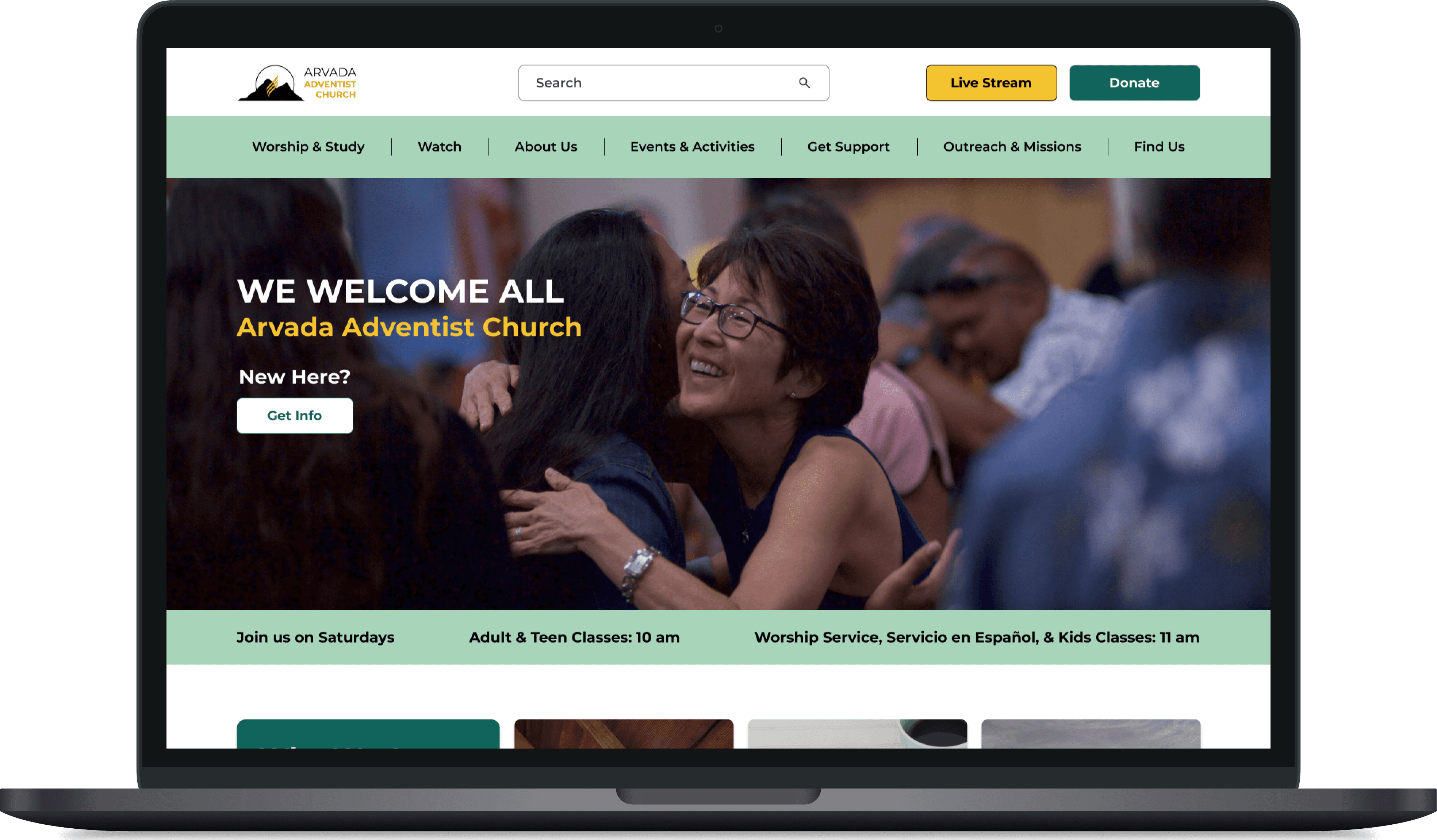
Live Stream and Donate as primary CTAs, static hero, and a nav structure shaped by card sort results.

Embedded video keeps users on the site for the live or most recent service. Sermon cards link to the full archive on the church's YouTube channel.

Upcoming events list replaces the calendar grid. Users see what's happening this week without having to click through a calendar.
Mobile

Live Stream as the sole primary CTA on mobile, prioritizing what testing showed mattered most.

Accordion menus replace card layout on mobile, collapsing the same content into a scannable list.
Next Steps
1
Replace stock photography with photography of actual members and programs
Trust came up consistently in the research, and the visual identity should reflect the community the site is asking newcomers to join.
2
Develop content for the Outreach and Missions page
The donation callout depends on real program detail and mission stories alongside it. Without that content, the placement is doing only part of the work testing pointed to.
3
Add short-form video to the About Us section
30 to 90 second clips would replace static text. Research suggested newcomers want to get a feel for the community before showing up in person, and video gives them a faster way to do that.